|
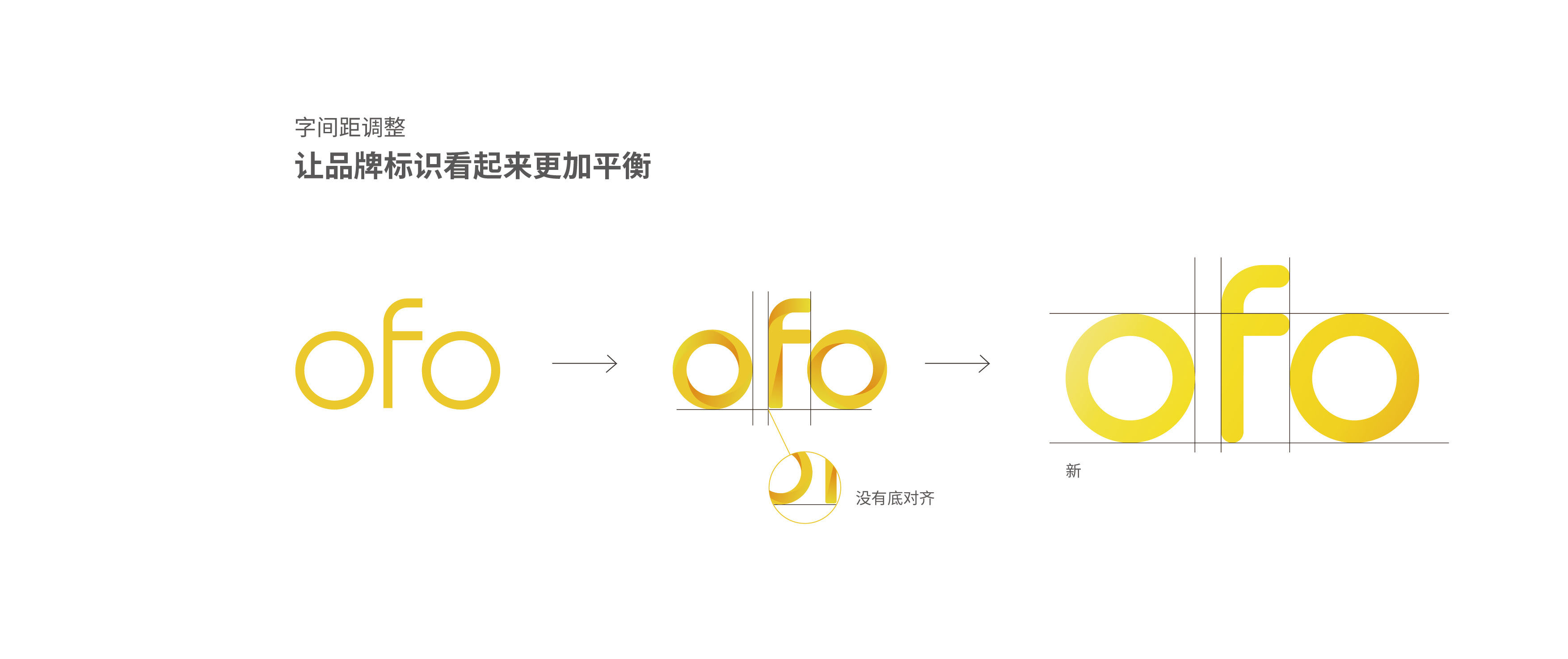
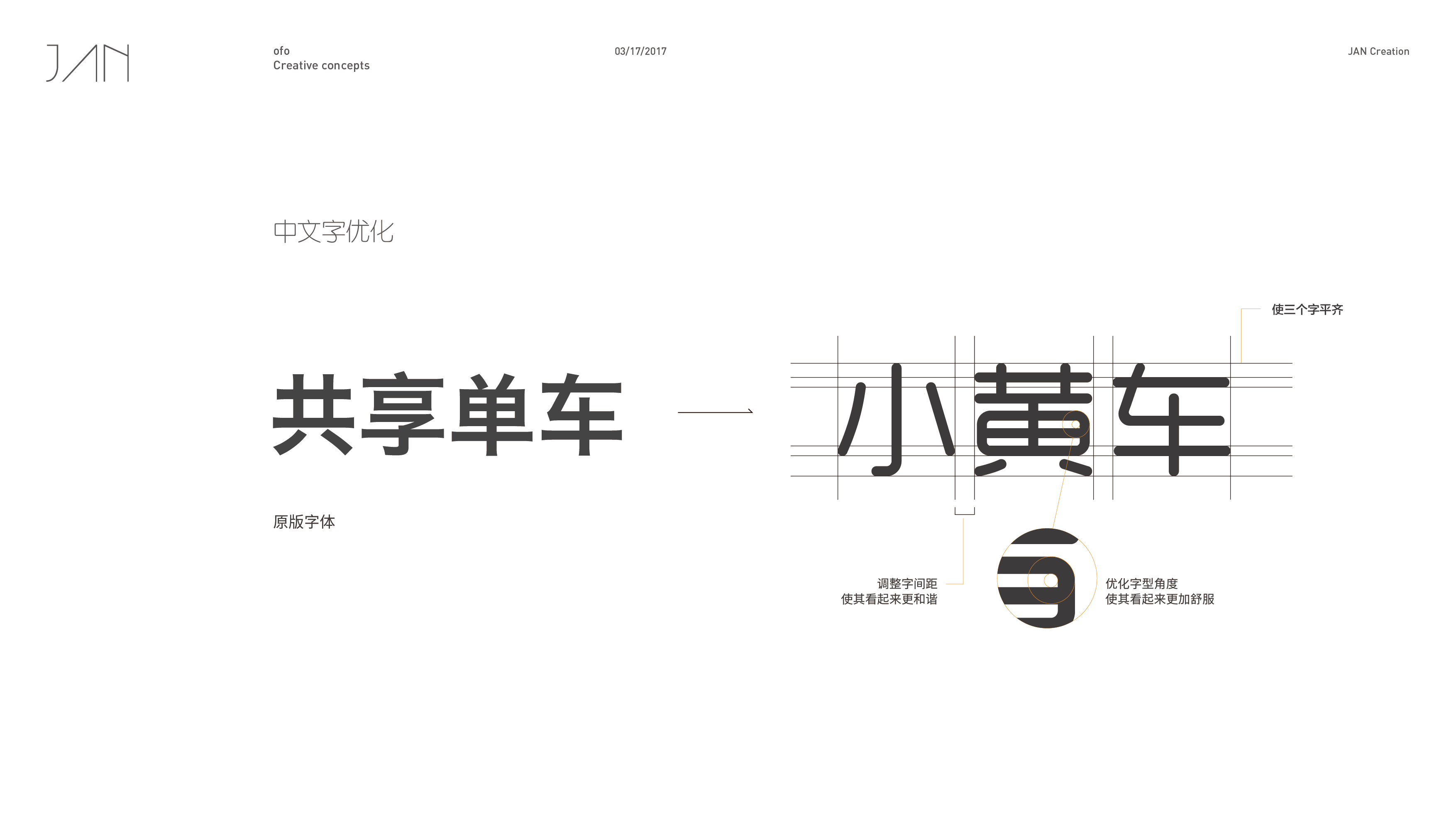
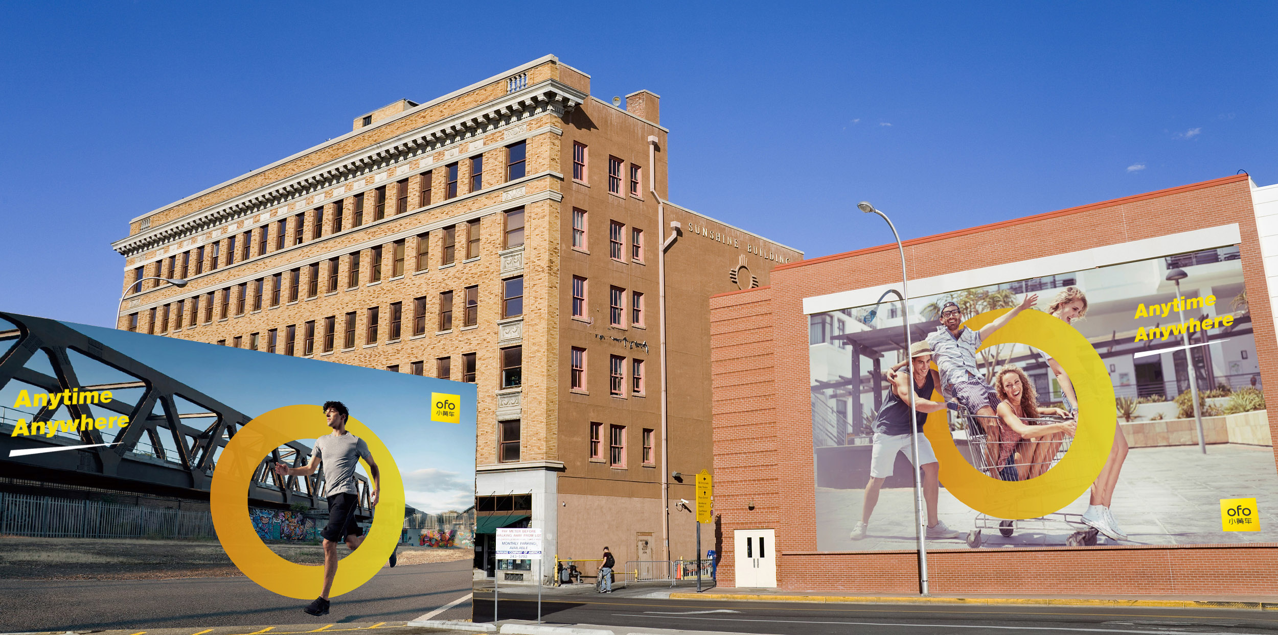
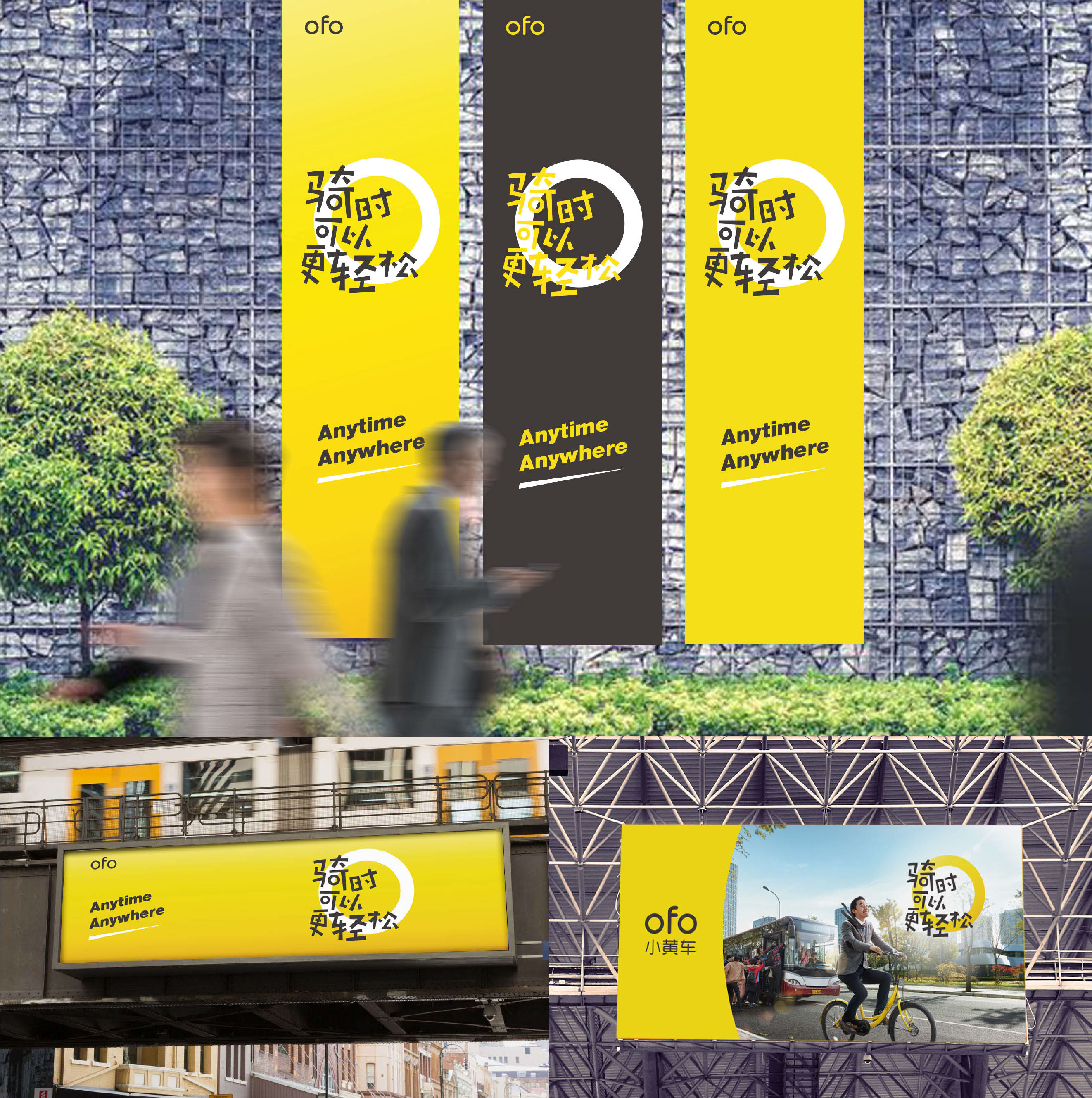
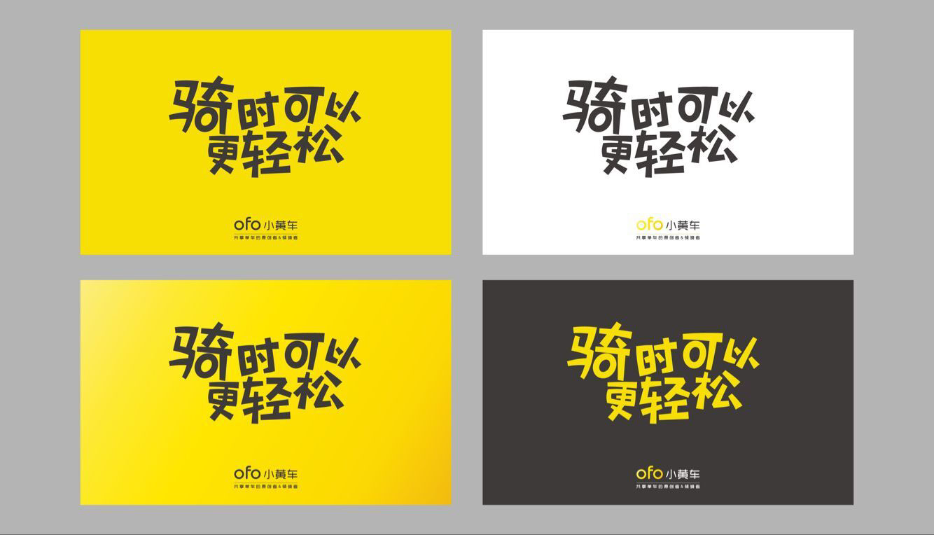
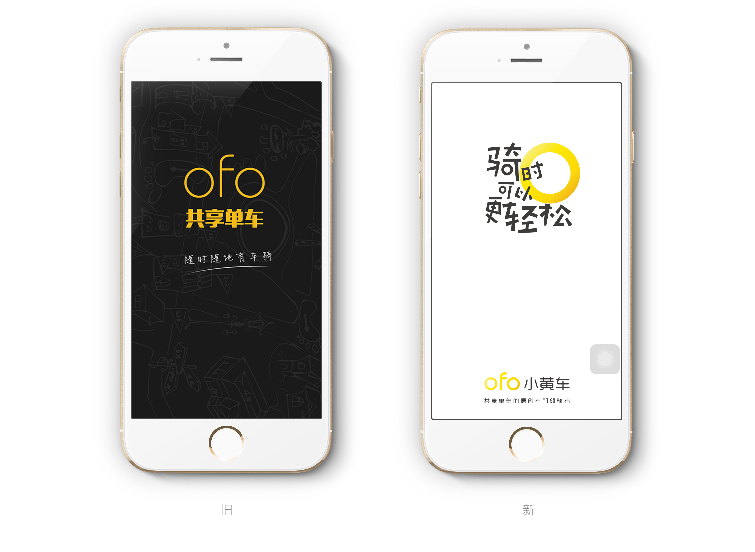
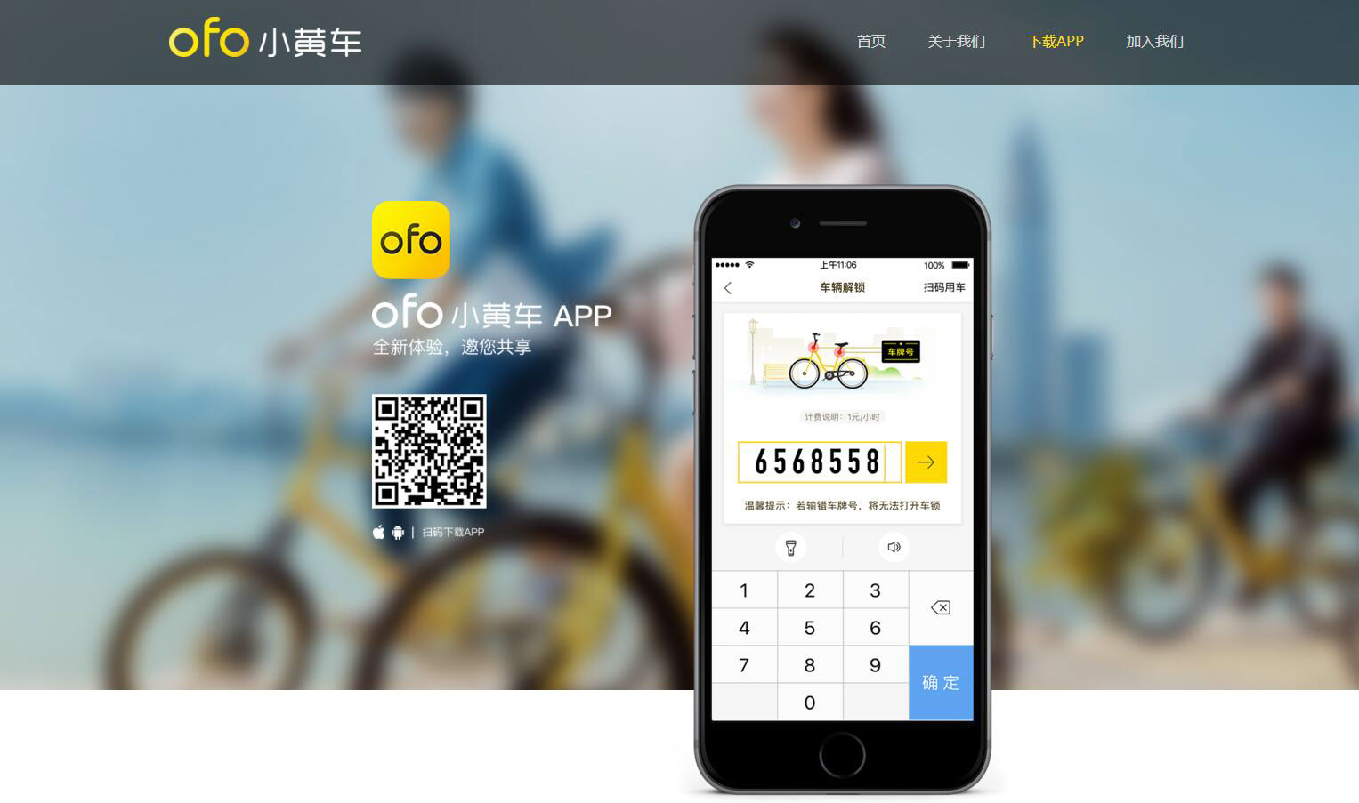
在过去一个月中,JAN与ofo深度合作,对ofo品牌VI系统进行全面升级,主要针对于ofo品牌拓展中国100个城市的大计划,解决ofo品牌色彩比较浅、字体比较细、中文字体不匹配、运用在宣传物料上识别度不够高、品牌团队在拓展城市时品牌露出保持高度统一等问题。
In the past month, JAN and ofo depth of cooperation, ono brand VI system to a comprehensive upgrade, mainly for the brand of China to expand China's 100 cities in the big plan to solve the brand color is relatively shallow, the font is relatively small, the Chinese font does not match , The use of publicity materials in the recognition is not high enough, the brand team in the expansion of the city when the brand exposed to maintain a high degree of reunification and other issues.
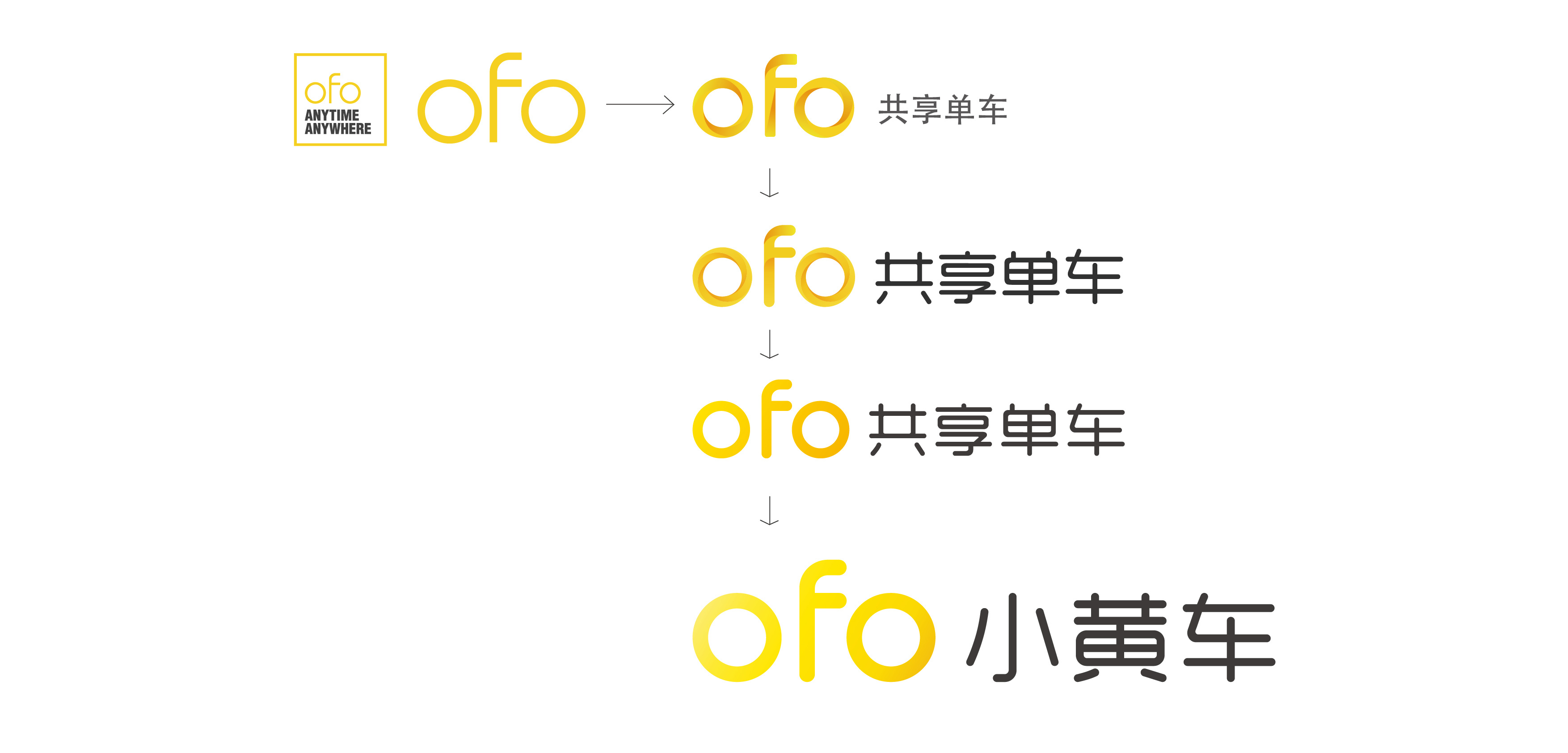

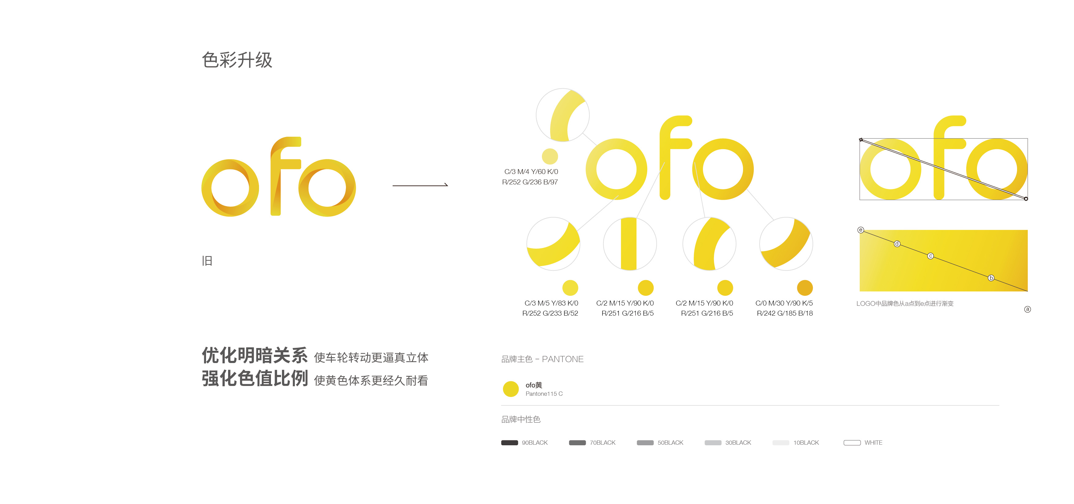
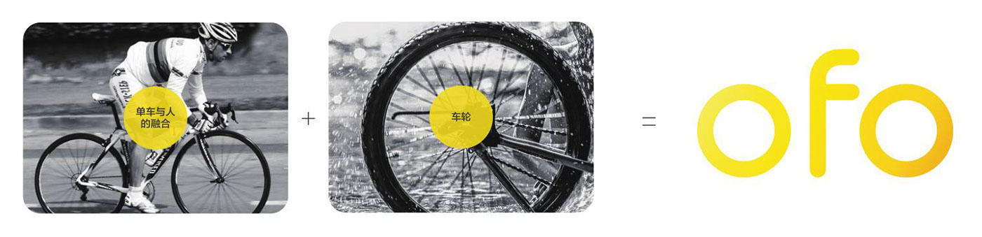
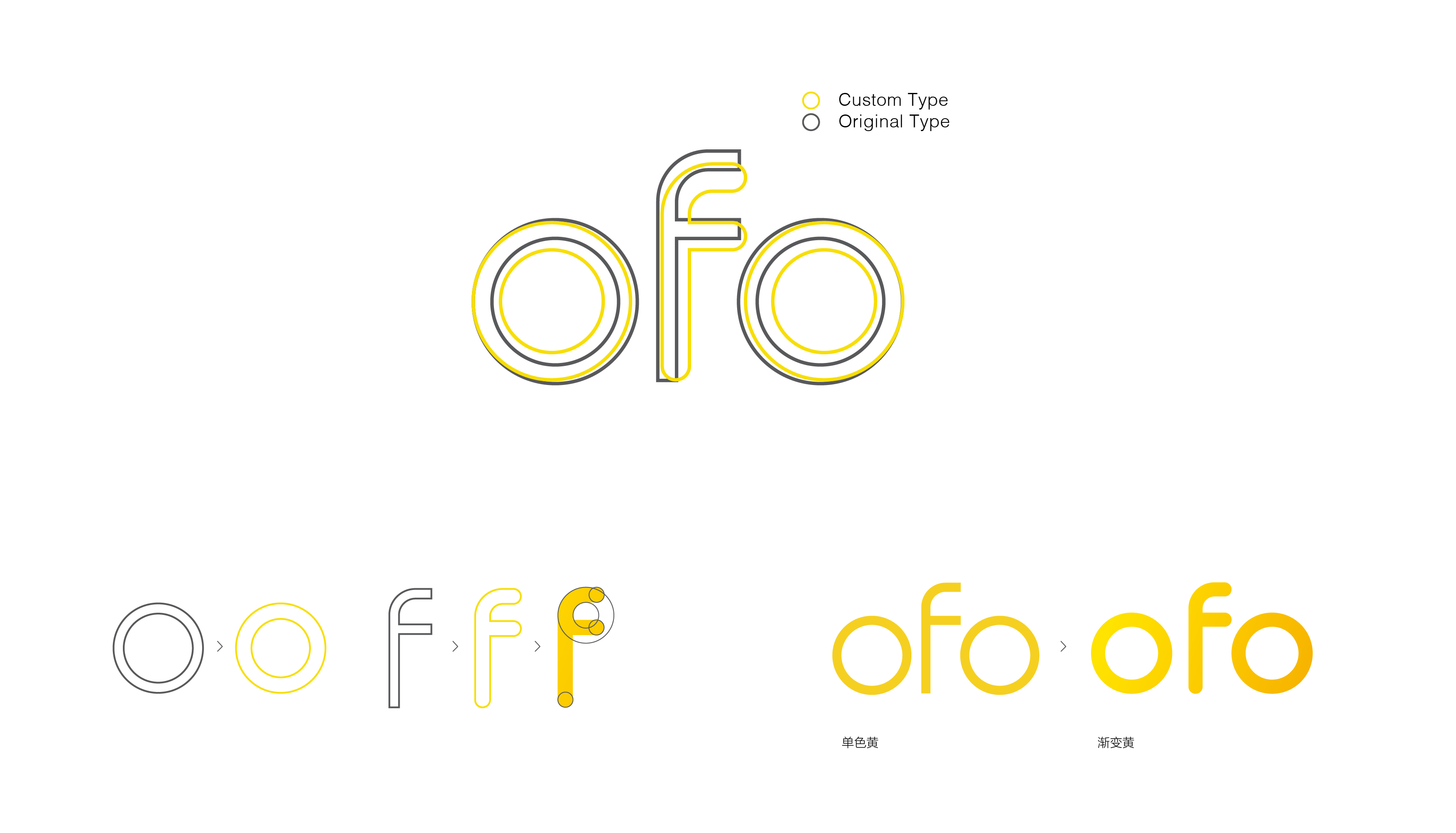
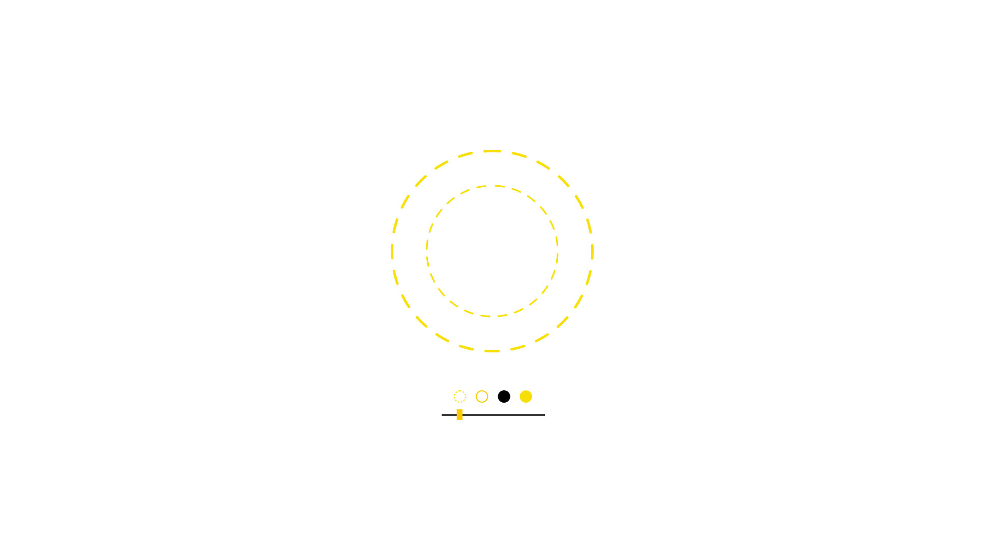
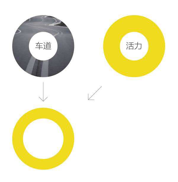
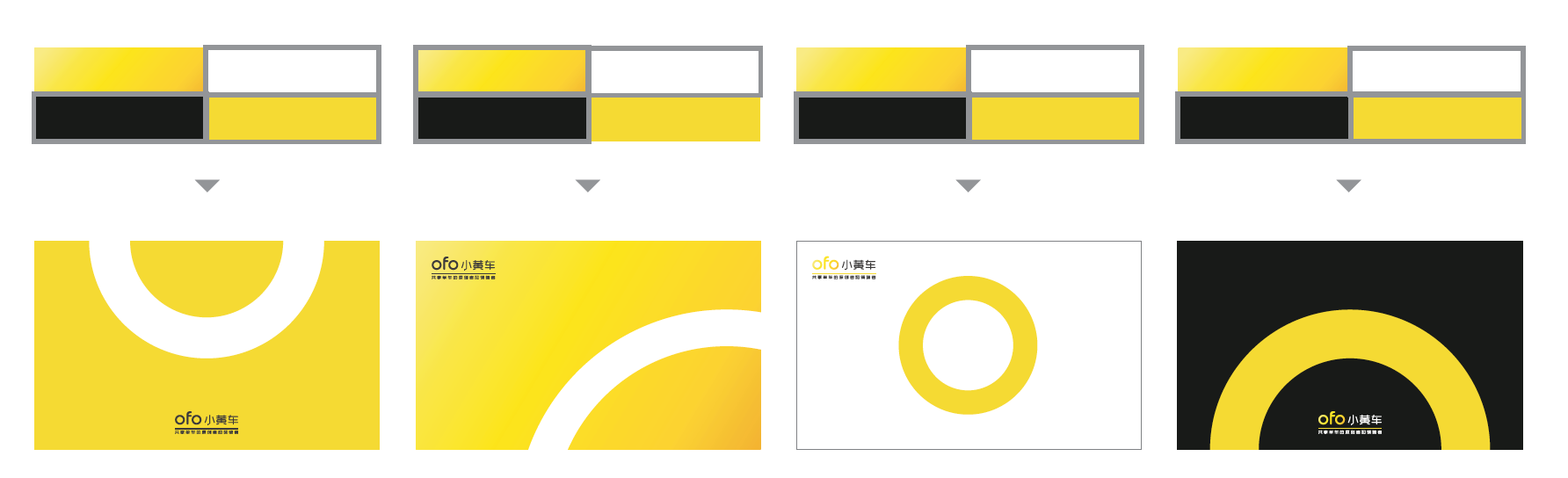
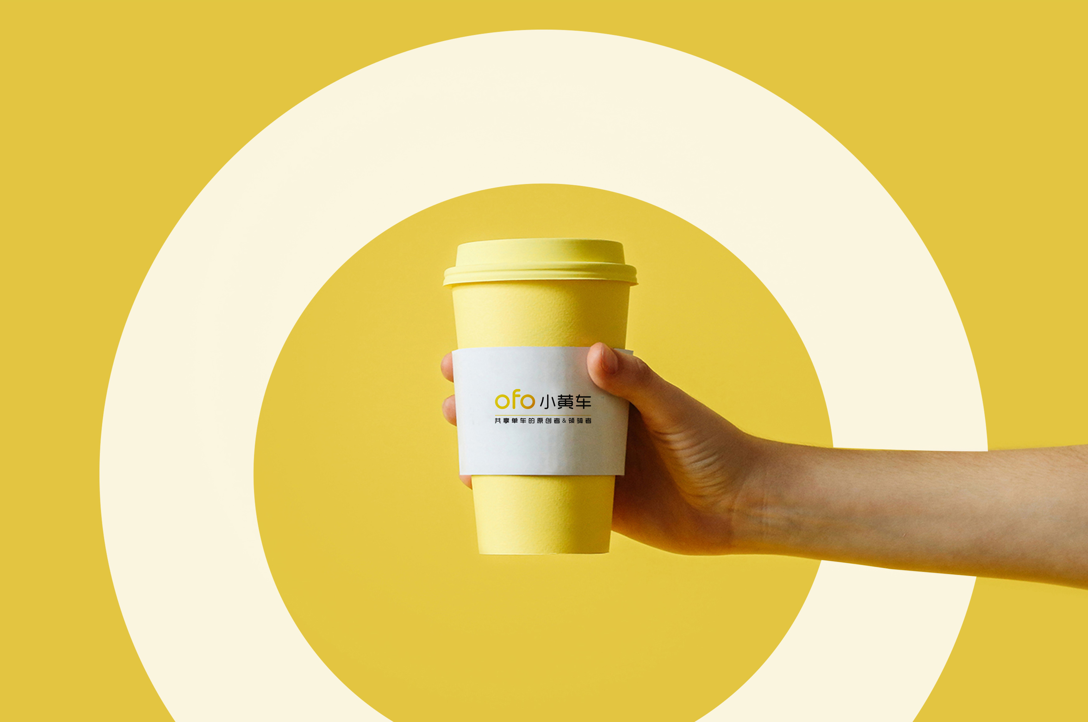
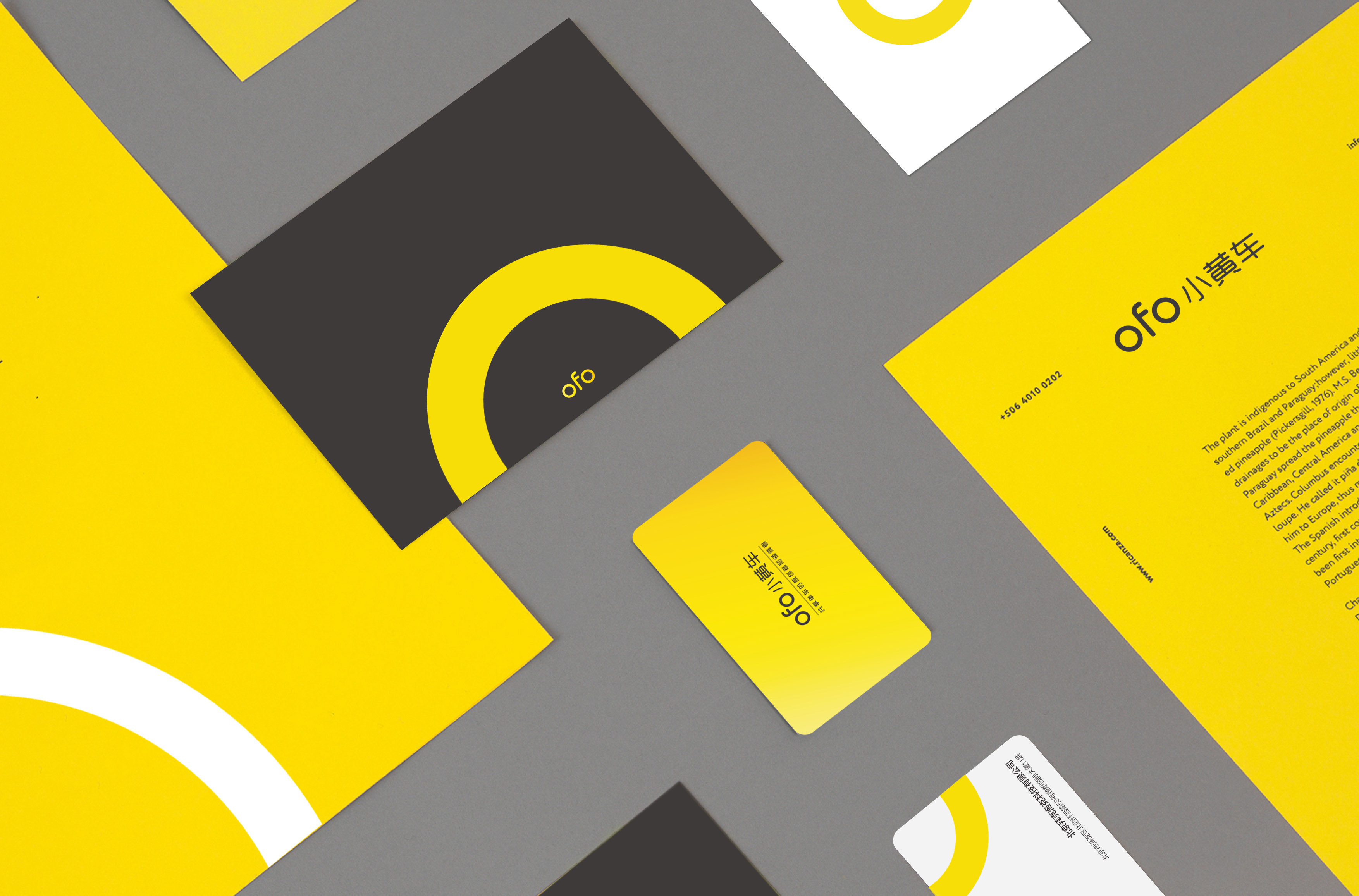
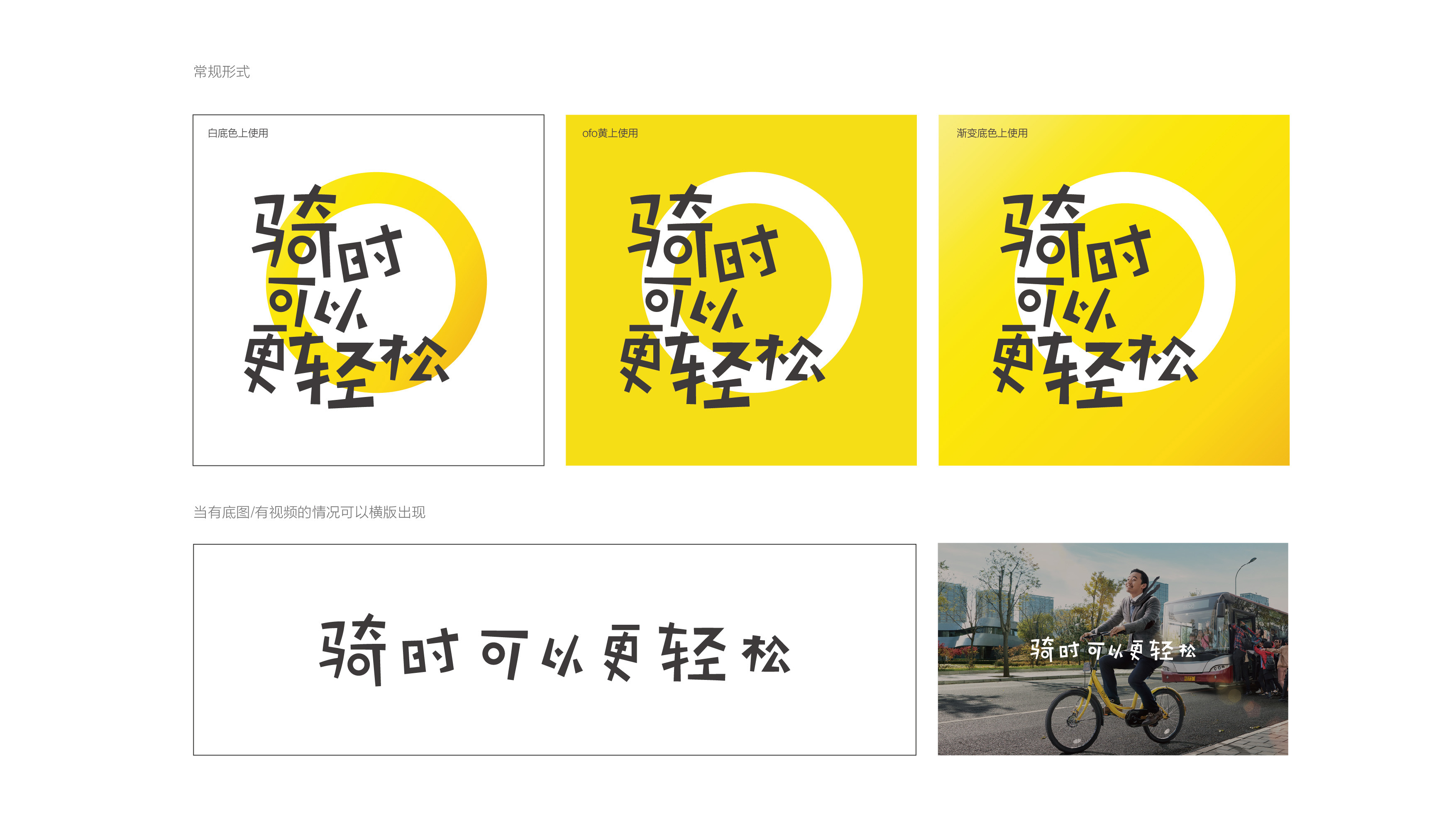
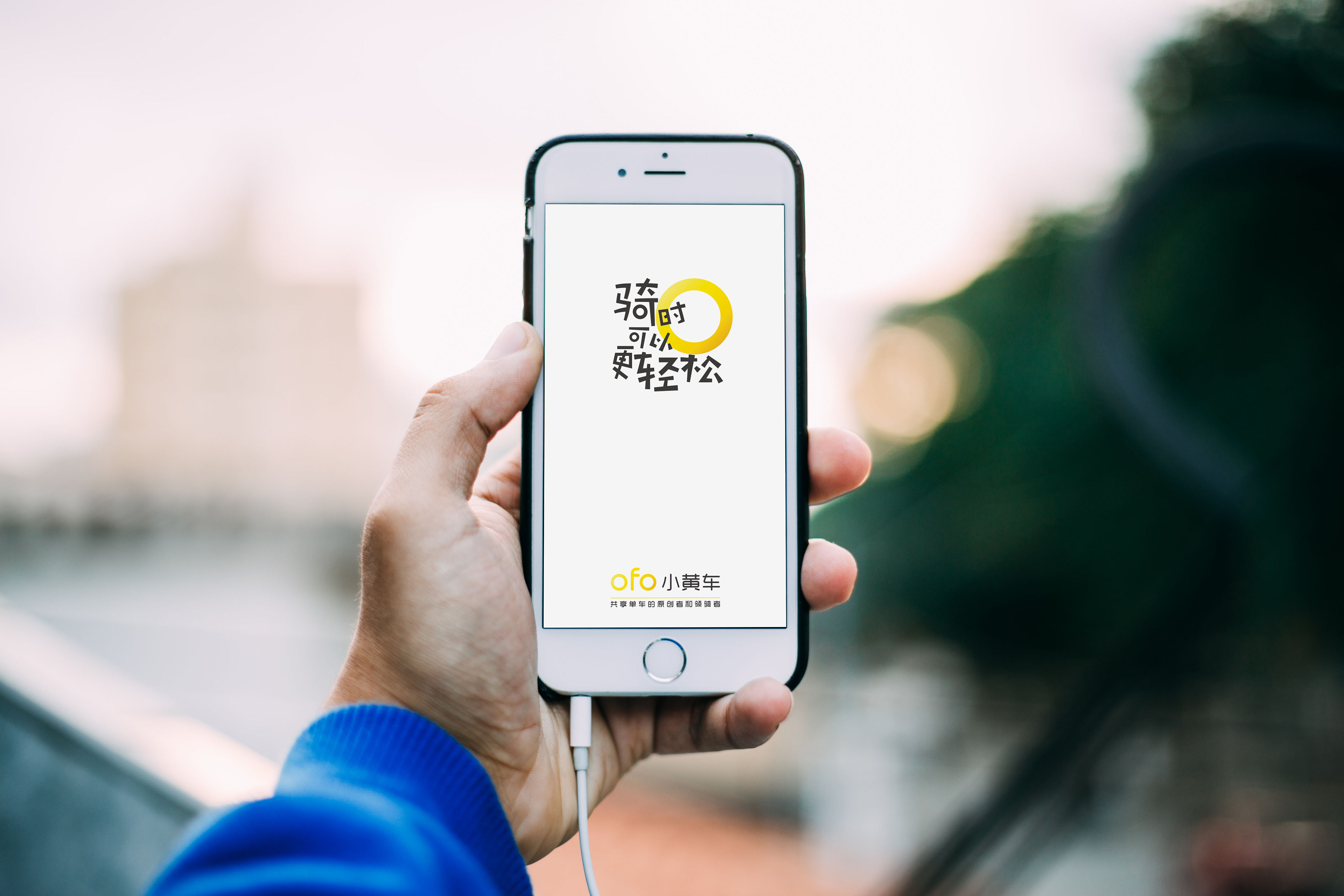
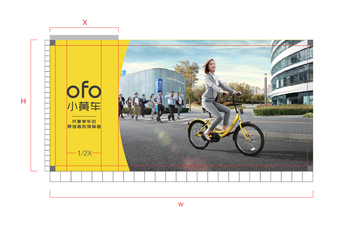
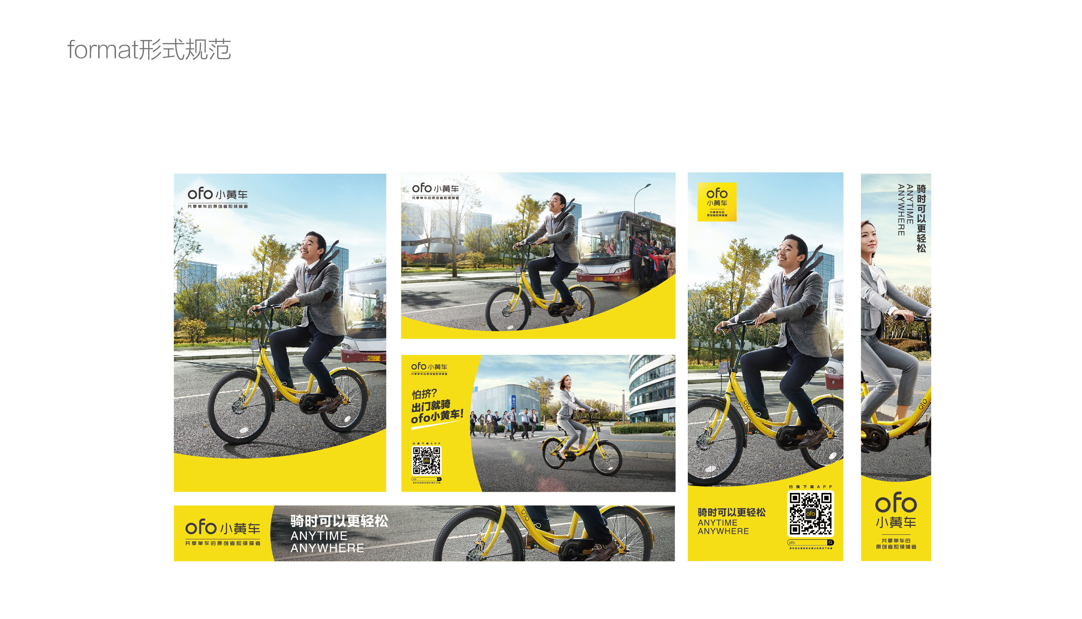
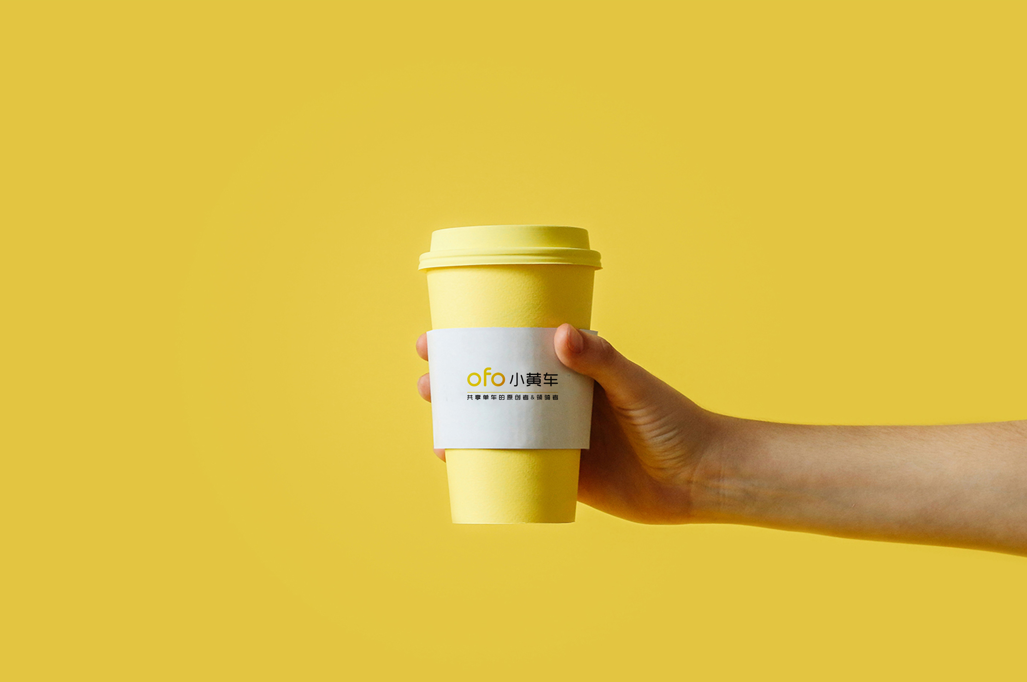
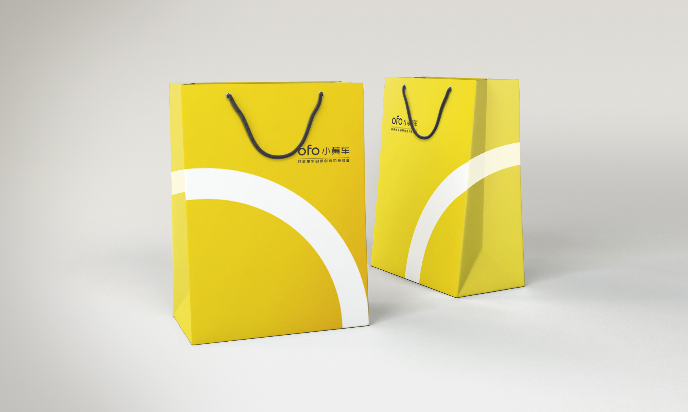
从单一的黄色升级成为ofo小黄车系统渐变色彩。以共享精神营造社会互信文化;而这份正向的精神倡导,同样从黄色的视觉体验中得到体现;流畅的渐变黄色,赋予了图形动感的表达,更有活力。这正是ofo品牌伴随骑行者成为城市一道正能量的风景线的最好体现。
From a single yellow upgrade to becomeo yellow car system gradient color. To share the spirit of creating a social trust culture; and the positive spirit of advocacy, the same from the yellow visual experience to be reflected; smooth gradient yellow, giving the dynamic expression of the dynamic, more dynamic. This is exactly the best embodiment of the brand with the rider to become a city of positive energy.

|