|
今天,看了“水牛仔”的ps英文版教程,觉得蛮不错的.
下午,闲的没事,就给翻译一下,译得不好,请大家凑合着看吧·~~~~~嘿嘿
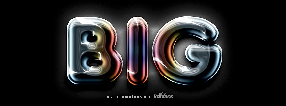
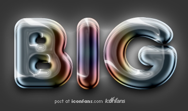
效果
下面进入正题:
We’ve seen many photoshop tutorials showing how to create the chrome text effect. In this tutorial we will go a step further and create a colored chrome text effect.
First we need a bold rounded font. We can get a free one from urbanfonts.com. Let’s pick Adira Display. Then create a new file. Dimensions should be 500px x 500px. A dark gray background is just fine. Don’t pick black as we are going to adjust that part later with an adjustment layer. Write the world BIG in a new layer with font size of 190pt approx. Like the image below:
翻译:
我们曾见过许多关于ps制作铬合金文字效果的教程。在这篇文章中我们将进一步学习相关的案例。
首先,我们需要粗体浑圆样式的字体。大家可以去(urbanfonts.com)下载字体。接下来我们用的是Adira Display字体样式。新建一个文档,尺寸为500*500像素。背景色不要用纯黑,最好是选择灰一点的颜色,因为待会我们要把它作为一个调整层。然后,新建一层并写上“big”,文字的尺寸大约为190pt。如图:

Double click on the font layer to bring up the layer styles window. Click on Gradient overlay and create the gradient that you will see on the following image.
翻译:
双击文字层进入图层样式面板,选择“渐变叠加”方式,(单击颜色条)调整渐变滑块的颜色,如下调整:
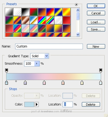
We will need 6 colors and the values (from left to right) are:
1. #bedeec
2. #bcb7d7
3. #f0c9d7
4. #f5c8b5
5. #f5f2ca
6. #dff3fe
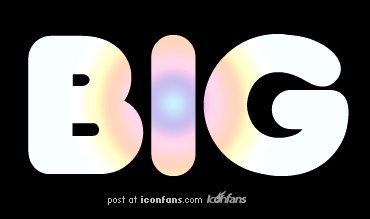
Now we should have the following image:
翻译:
你所需要的颜色及属性(从左至右):
1.
#bedeec
2. #bcb7d7
3. #f0c9d7
4. #f5c8b5
5. #f5f2ca
6. #dff3fe
调整完毕后,确定,你将得到以下的效果:
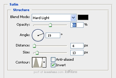
Back in the layer styles click on Satin and enter the following settings:
翻译:
回到图层样式,选择“光泽”,进行如下设置:
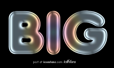
And now we should have something like this:
现在你应该得到如下的图片了。
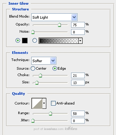
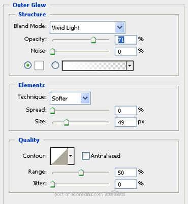
Now we are going to apply the following styles. Inner glow, Outer glow, Inner Shadow and Drop Shadow. Let’s see the settings for each one of them
翻译:
现在,我们将进行以下设置:内发光、外发光、内阴影,阴影。请大家按照如下参数对各自进行一一设置:
内发光:
外发光:
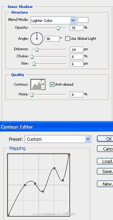
Inner shadow uses a custom Contour setting which can be seen in the following image
内阴影的定义参数如下:
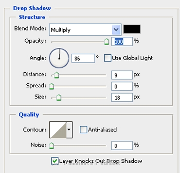
阴影:
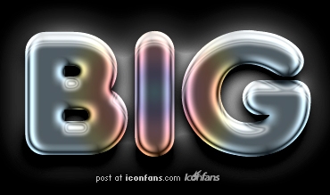
好了,我们现在得到如下效果:
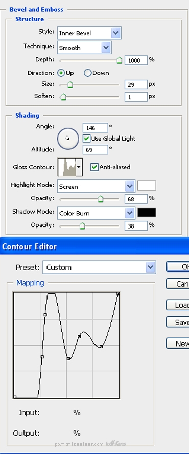
It looks OK but we can improve it. Actually it doesn’t look like chrome yet. We need to apply the following Bevel and Emboss style to get there. Let’s see the settings. The custom Contour can be found on the following image too:
翻译:
看上去似乎已经差不多了。事实上它还不怎么像铬合金的效果。我们需要应用“斜面和浮雕”样式获取更好的效果。让我们看看以下的参数设置:
效果:
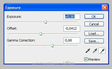
Ah. That’s better. A bit darker would do the trick don’t you think? Let’s do it then. Go to Layer -> Add Adjustment Layer -> Exposure and enter the following settings:
翻译:
恩,现在是不是好一些了呢。如果整体再暗一点,是不是离完工就不远了呢?好,回到图层---添加“曝光度”,进行如下设置:
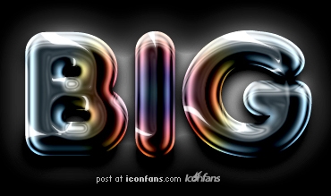
Ok,大功告成~~~~~~~~~~~~~~~~~~~@
|